
Orchestrating Care at Scale: The Design System Behind AdeaHealth's Global Expansion
Orchestrating Care at Scale: The Design System Behind AdeaHealth's Global Expansion
Orchestrating Care at Scale: The Design System Behind AdeaHealth's Global Expansion
AdeaHealth delivers root-cause care for chronic conditions across specialist networks. As Founding Designer, I architected a modular design system that increased patient activation by 35%, reduced clinical coordination overhead by 30%, and enabled 3x faster product launches for international expansion.
AdeaHealth delivers root-cause care for chronic conditions across specialist networks. As Founding Designer, I architected a modular design system that increased patient activation by 35%, reduced clinical coordination overhead by 30%, and enabled 3x faster product launches for international expansion.
Role.
Role.
Founding Designer (2021) → Senior Designer (2023) → Part-time Consultant (May 2026)
Senior Product Designer (Founding)
Senior Product Designer (Founding)
Team.
Team.
2 Designers · 2 Engineers · 1 Clinical Lead
2 Designers · 2 Engineers · 1 Clinical Lead
Platforms.
Platforms.
Website · Patient Dashboard · Coach Dashboard · Specialist Dashboard · Mobile App
Website · Patient Dashboard · Coach Dashboard · Specialist Dashboard · Mobile App
01 / The challenge
The Problem Was Service Design, Not Orchestration.
The Problem Was Service Design, Not Orchestration.
The Problem Was Service Design, Not Orchestration.
The Problem Was Service Design, Not Orchestration.
AdeaHealth delivers 360° root-cause care across multiple health needs - nutrition, mental health, lifestyle, longevity, and specific conditions. The platform hs now consolidated into four core programmes: Health+, Health+ Essential, Health+ Advanced, and Longevity+. Each programme includes multidisciplinary specialist teams and ongoing coaching.
When I joined, the company had a critical problem: programmes had evolved organically across different conditions, operational workflows varied between teams, and patients struggled to understand which programme matched their needs.
At the same time:
• Consultation demand was increasing through marketing campaigns
• Specialist coordination was becoming harder to manage
• New programme launches required significant operational effort
• Existing product experiences reflected internal workflows rather than patient understanding
The business needed a structure that could scale across both patient experience and operations.
Their initial hypothesis was that coaches needed better tools to manage patients across programmes. But when I followed the actual user journey, I discovered the real problem was much earlier: patients didn't understand what each programme included, what steps came next, or how to navigate once enrolled.
This wasn't an orchestration problem. It was a service design problem. The drop-offs weren't happening in the dashboards. They were happening on the website - at the decision point.
Image/
The Drop-off Diagnosis (Journey Audit) :
Audited the current patient journey, identified where drop-offs were highest, mapped user impact, and isolated design opportunities.
Image/
The Drop-off Diagnosis (Journey Audit) :
Audited the current patient journey, identified where drop-offs were highest, mapped user impact, and isolated design opportunities.

Image/
Connecting the Dots (Research Workshops):
Facilitated workshops bridging clinical safety with user empathy. Mind map shows insights from conversations with clinicians and patients.
Image/
Connecting the Dots (Research Workshops):
Facilitated workshops bridging clinical safety with user empathy. Mind map shows insights from conversations with clinicians and patients.

Image/
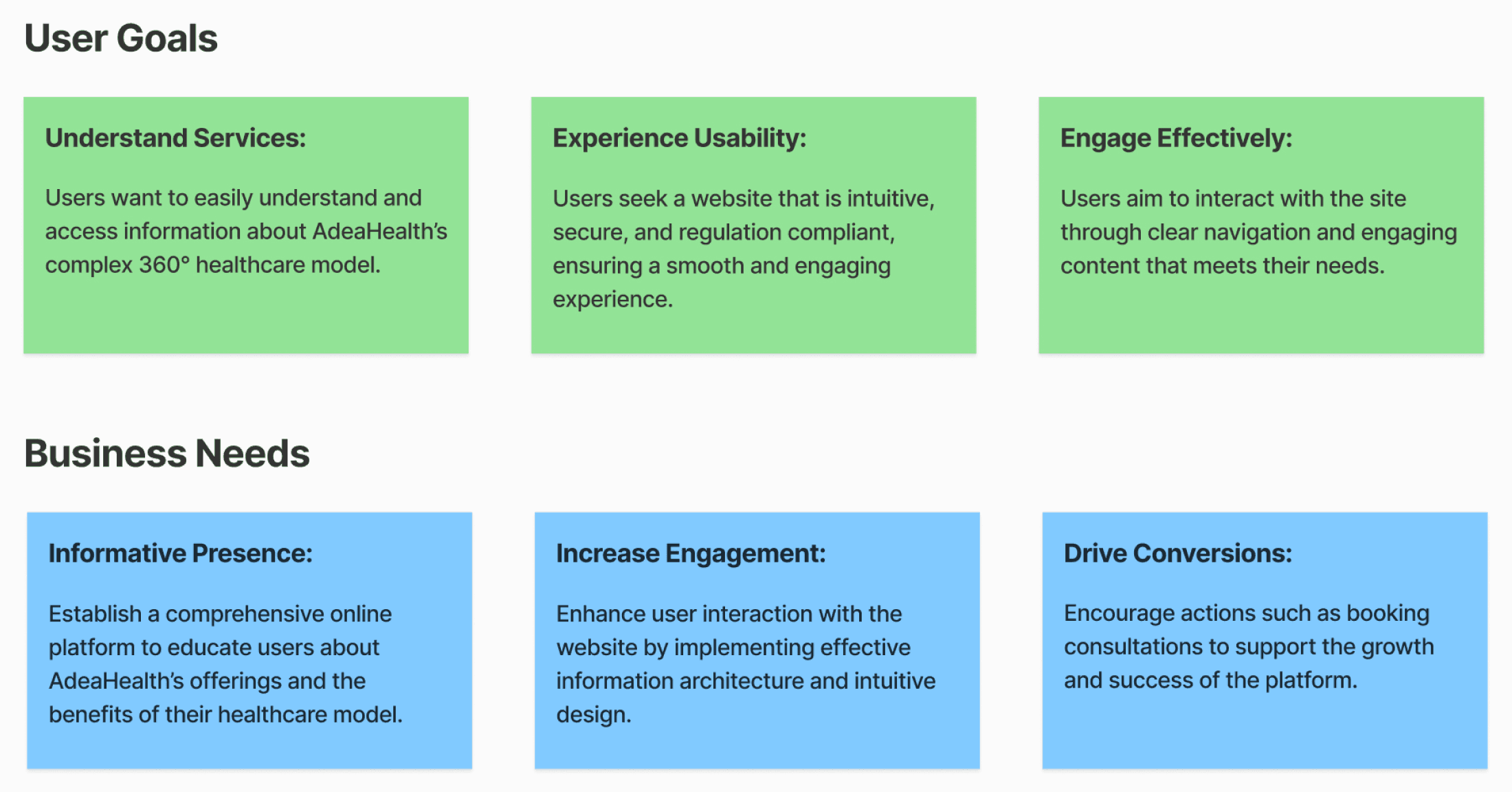
Defining Success:
Mapped alignment between user needs (clarity, progress, specialist coordination) and business needs (enrollment conversion, operational efficiency, safety).
Image/
Defining Success:
Mapped alignment between user needs (clarity, progress, specialist coordination) and business needs (enrollment conversion, operational efficiency, safety).
02 / The strategy
Three Layers: Website Clarity + Dashboard Workflows + Design System Foundation.
Three Layers: Website Clarity + Dashboard Workflows + Design System Foundation.
Three Layers: Website Clarity + Dashboard Workflows + Design System Foundation.
Rather than jump directly into dashboards, I first needed to understand how patients, clinicians, operational systems, and support workflows interconnected across the entire care journey. The challenge wasn’t isolated to a single interface. It was structural.
To diagnose the problem properly, I mapped:
patient journeys
clinician workflows
service blueprints
operational dependencies
information architecture
support systems and escalation flows
This revealed a critical insight:
Patients were struggling to understand the service before enrollment, while internal teams were struggling to coordinate care after enrollment.
The strategy therefore evolved into three connected layers:
Clarifying the patient decision-making experience through website and programme redesign
Operationalizing care delivery through role-based dashboards
Creating scalable systems and reusable patterns to support future programme growth
The strategy had three components:
Service Design for Patient Decision (Website)
Service Design for Patient Decision (Website)
Clear programme positioning
Visual journey mapping showing what happens at each stage
Explicit team composition and what's included
Transparent pricing and clear next steps
Role-Based Workflows for Care Delivery (Dashboards)
Role-Based Workflows for Care Delivery (Dashboards)
Patient dashboard: clarity on their journey and progress
Coach dashboard: orchestration layer managing multiple patients and specialists
Specialist dashboard: role-specific context and actions
All three connected through unified patterns (same navigation, same alert logic, same interaction language)
Modular Design System for Scalability
Modular Design System for Scalability
Unified visual language across website and dashboards
Consistent interaction patterns so users experience coherence
Reusable components so new programmes don't require redesign
Image/
Image/
The Service Blueprint (Final):
The complete care delivery blueprint showing patient touchpoints, coach/specialist actions, support systems, and data flow.
Image/
The Service Blueprint (Final):
The complete care delivery blueprint showing patient touchpoints, coach/specialist actions, support systems, and data flow.

Image/
Synchronizing Actors:
User personas and journey maps for patients and healthcare providers designed together, showing how their needs interconnect.
Image/
Synchronizing Actors:
User personas and journey maps for patients and healthcare providers designed together, showing how their needs interconnect.

Image/
Architecting the Logic:
Information architecture explorations, sitemaps, and service design scenarios showing the iterative process before final decisions.
Image/
Architecting the Logic:
Information architecture explorations, sitemaps, and service design scenarios showing the iterative process before final decisions.

Image/
The Execution Roadmap:
Design sprint roadmap mapping tasks, objectives, and outcomes. User interviews, stakeholder workshops, market benchmarking, blueprinting, and journey maps.
Image/
The Execution Roadmap:
Design sprint roadmap mapping tasks, objectives, and outcomes. User interviews, stakeholder workshops, market benchmarking, blueprinting, and journey maps.

03 / The execution
Where We Started - The Fragmentation Problem.
Where We Started - The Fragmentation Problem.
Where We Started - The Fragmentation Problem.
Where We Started - The Fragmentation Problem.
When I joined, AdeaHealth’s services had already evolved operationally, but the user experience hadn’t evolved with them. The platform was still structured around fragmented, condition-specific programmes with inconsistent workflows, disconnected messaging, and unclear relationships between offerings.
At the same time, the business itself had shifted from four isolated pillars into a more connected care ecosystem with Health+ acting as the coordinating layer. However, this new structure wasn’t reflected in the patient experience. As a result:
patients struggled to differentiate programmes
the care journey felt overwhelming
internal coordination became increasingly fragmented
Execution therefore focused on two phases:
Simplifying the service and programme experience
Operationalizing the service through connected dashboards and shared systems
Phase 1: Simplifying the Service (Website & Programmes)
I started where the business problem was actually happening: the website and programme experience.
Patients needed to understand: which programme was right for them, how the care journey worked, what happened after enrollment and what level of support they would receive. The original service structure involved eight disconnected operational steps that felt overwhelming for patients already dealing with health concerns. To reduce cognitive overload, I redesigned the experience into three clear stages: 1. Assessment, 2. Diagnosis and 3. Care Planning. Each stage contained smaller substeps underneath, giving patients: a clearer mental model, visible progress, reduced anxiety, and confidence in what came next.
At the same time, I restructured the programme ecosystem itself. Instead of presenting separate condition-specific services, alongwith the Health+ Director we unified the offerings into a clearer spectrum of care:
Health+
Health+ Essential
Health+ Advanced
Longevity+
This created stronger differentiation, clearer expectations, and a more scalable foundation for future programme expansion.
Most importantly, the three-stage framework later became the blueprint for the dashboards themselves, creating continuity between the website and the operational product experience.
Image/
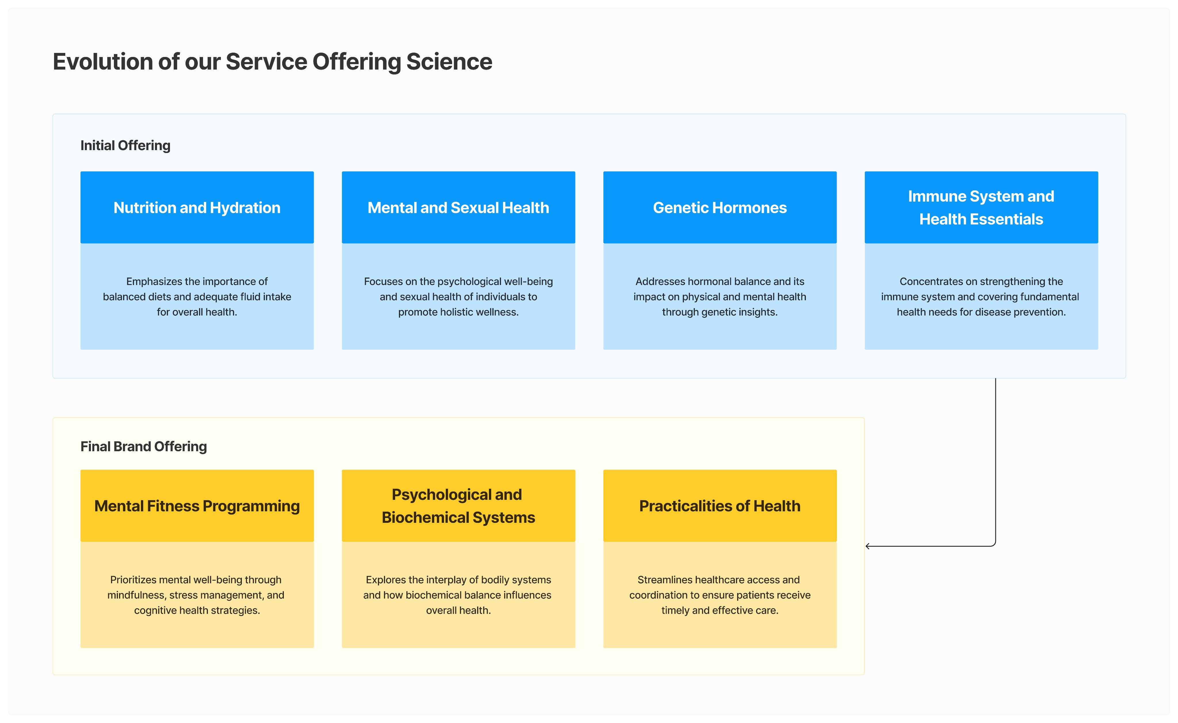
Evolving the Science:
Structural shift from four separate pillars to three pillars with Health+ as the coordinating layer.
Image/
Evolving the Science:
Structural shift from four separate pillars to three pillars with Health+ as the coordinating layer.
Image/
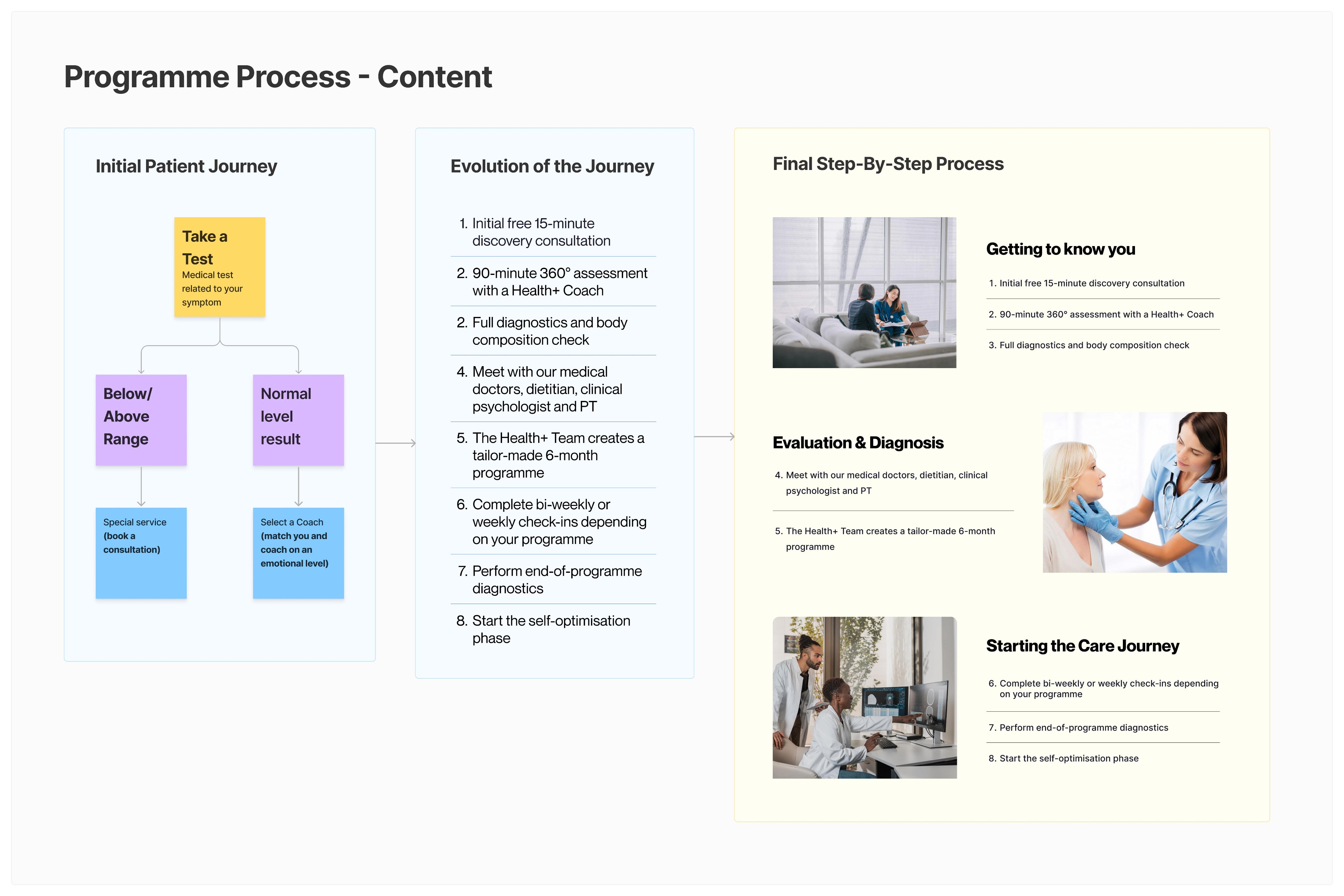
The Three-Stage Journey:
Simplified patient journey from eight overwhelming steps to three clear stages (Assessment, Diagnosis, Care Planning) with substeps. This became the foundational blueprint for dashboards.
Image/
The Three-Stage Journey:
Simplified patient journey from eight overwhelming steps to three clear stages (Assessment, Diagnosis, Care Planning) with substeps. This became the foundational blueprint for dashboards.


Image/
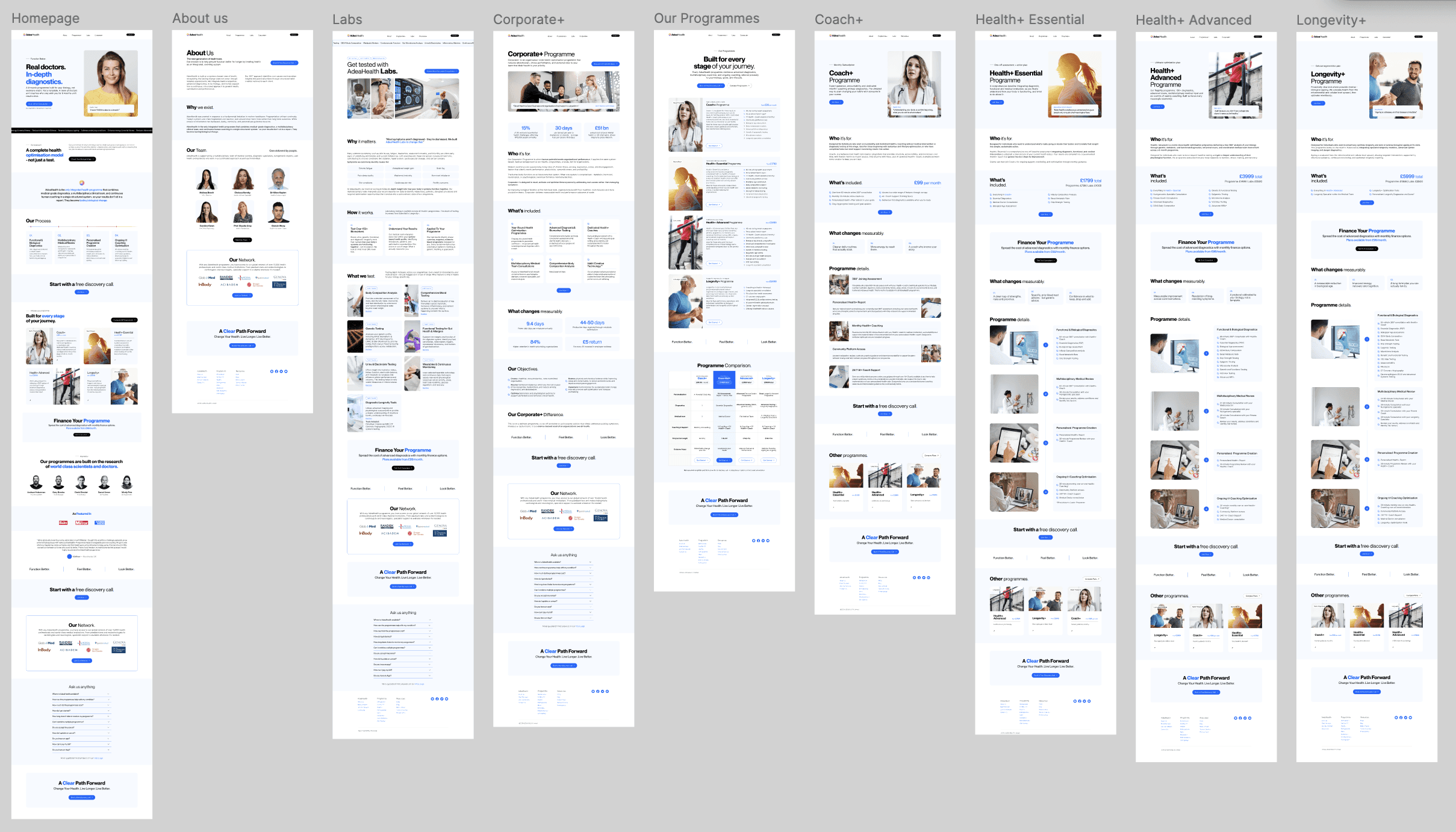
Final Programme Pages:
All four programmes (Health+, Health+ Essential, Health+ Advanced, Longevity+) unified under consistent design language, clear positioning, and transparent pricing.
Image/
Final Programme Pages:
All four programmes (Health+, Health+ Essential, Health+ Advanced, Longevity+) unified under consistent design language, clear positioning, and transparent pricing.

Image/
Website Ecosystem:
Shared structures and reusable layouts created continuity across programme, corporate, educational, and onboarding experiences.
Image/
Website Ecosystem:
Shared structures and reusable layouts created continuity across programme, corporate, educational, and onboarding experiences.
Image/
Iterative Refinement:
Programme page evolution over time, showing how design refined through user feedback and conversion data.
Image/
Iterative Refinement:
Programme page evolution over time, showing how design refined through user feedback and conversion data.

03 / The execution.
From Systems to Screens
Phase 2: Operationalizing the Service (Dashboards)
Once the website and service structure became clearer, the next challenge was operational coordination. The three-stage framework established on the website now needed to continue into the product experience itself. Rather than designing isolated dashboards, I approached the system as one connected ecosystem supporting three user types:
03 / The execution.
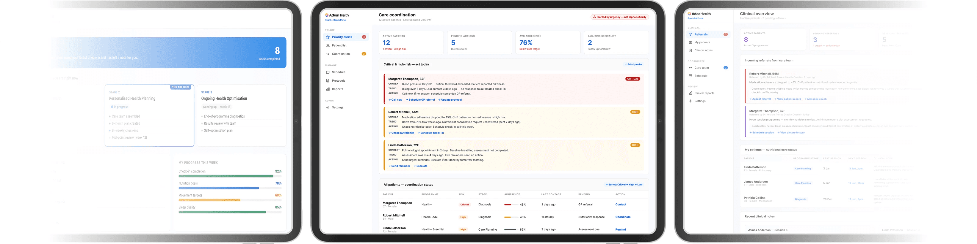
Patient Dashboard
Patient Dashboard
Shows the three-stage journey with current progress, upcoming appointments, specialist coordination, and personalized recommendations. Patients always know which stage they're in and what comes next.
Image/
Patient Dashboard:
Designed around clarity and continuity of care — showing current stage, active alerts, upcoming appointments, care team coordination, and personalised next steps throughout the health journey.
Image/
Patient Dashboard:
Designed around clarity and continuity of care — showing current stage, active alerts, upcoming appointments, care team coordination, and personalised next steps throughout the health journey.

03 / The execution.
Coach Dashboard
Coach Dashboard
The orchestration layer. Multi-patient view showing all patients, their current stage, pending actions, active alerts, and high-priority patients. Coaches can coordinate across specialists without context switching. Alerts show context (what's happening), trend (what changed), and action (what to do) — not just colours.
Image/
Coach dashboard:
Operational coordination layer helping health coaches manage multiple patients, monitor high-risk alerts, coordinate specialists, and prioritise follow-ups through explainable alert systems.
Image/
Coach dashboard:
Operational coordination layer helping health coaches manage multiple patients, monitor high-risk alerts, coordinate specialists, and prioritise follow-ups through explainable alert systems.

03 / The execution.
Specialist Dashboard
Specialist Dashboard
Role-specific view showing their patients, relevant cases, clinical protocols, and recommended next steps. Same navigation and alert logic as the coach dashboard, but filtered to the specialist's scope.
Image/
Specialist dashboard:
Role-specific clinical workspace focused on assigned cases, pending assessments, treatment workflows, and contextual patient information required for specialist decision-making.
Image/
Specialist dashboard:
Role-specific clinical workspace focused on assigned cases, pending assessments, treatment workflows, and contextual patient information required for specialist decision-making.

03 / The execution.
From Systems to Screens
Across all dashboards and touchpoints, I maintained shared interaction patterns and visual logic to create continuity throughout the ecosystem.
Patients, coaches, and specialists all interacted with:
the same navigation structures
consistent alert behaviour
shared card systems
unified interaction states
predictable layout patterns
This reduced cognitive load, improved usability across roles, and allowed engineering teams to reuse patterns instead of rebuilding interfaces repeatedly.
The result was a platform that felt coherent across website, dashboard, and mobile experiences rather than fragmented into separate tools.
Note:
Note: These are current iterations of the dashboards. Like any live product, they're continuously evolving based on user feedback and clinical outcomes. The foundational logic and patterns are what enable scaling into new programmes and markets.
04 /
The Impact & Results.
The Impact & Results.
The Impact & Results.
The Impact & Results.
Drop-Off Reduction & Conversion Improvement
Drop-Off Reduction & Conversion Improvement
The website clarity directly addressed the initial problem:
Confusing programme pages and service design → low conversion from consultation to enrollment
Clear programme positioning and three-stage journey → patients understood next steps and chose to enroll
Result: Improved conversion rates from initial consultation
Operational Efficiency & Coordination
Operational Efficiency & Coordination
For coaches and specialists:
Fragmented tools and unclear workflows → coordination gaps, manual tracking, patient safety risk
Role-based dashboards with unified patterns → 3x faster specialist coordination
Explainable alerts replacing colour codes → 20% faster response time for high-risk patients
Design system consistency → 30% faster engineering implementation of new features
Patient Experience & Safety
Patient Experience & Safety
For patients:
Confusing journey and unclear next steps → drop-offs, anxiety, low engagement
Clear three-stage framework visible across website and dashboard → +35% patient activation
Specialist coordination visibility → trust in care continuity, 22% reduction in drop-offs
Unified design language across touchpoints → cohesive experience
Platform Scalability & Growth
Platform Scalability & Growth
For The Business:
Each new programme required full redesign → 6-8 weeks per launch, massive engineering resource waste
Modular design system enabling new programmes to inherit patterns → 2-3 weeks per launch
Reduced repeated redesign and engineering overhead through reusable system patterns
Architectural foundation for international expansion: system scaled from 4 conditions to 4 unified programmes without structural redesign
Team Alignment:
Unified design system and clear patterns → Strong engineering adoption due to reusable and predictable interaction patterns
Cross-functional alignment: engineering, clinicians, product teams aligned on shared logic rather than debating aesthetics
System became operationally foundational for how AdeaHealth achieved scale
05 /
Reflections.
Reflections.
Reflections.
Reflections.
On Service Design: Diagnosis comes before design. The initial assumption was that dashboards needed improvement. The actual problem was service-level clarity. Most of my impact came from fixing the earlier layer - the website and patient journey - not from UI optimization.
On Strategic Prioritization: Start where users drop off, not where you're asked to design. The website wasn't the "flashy" design work, but it was where the business problem manifested. Fixing it first prevented rework and multiplied impact downstream.
On Scaling Through Systems: You can't design for every new condition or market. You have to architect a system that new conditions can inherit. Modular thinking isn't about components - it's about foundational logic that flexes without breaking.
On Multi-User Design: Design for different user types simultaneously, not sequentially. The patient, coach, and specialist dashboards weren't separate projects. They were three role-based views of one coherent system. This prevented fragmentation and reduced implementation complexity.
On Simplification: Eight steps became three stages. Separate programmes became a unified spectrum. Complex clinical logic became explainable alerts. Simplification is systems work — it requires understanding what can be removed without losing critical information.
What I'd Do Differently: I'd validate the three-stage framework through user testing earlier, rather than discovering its power through implementation. Rapid testing of different journey structures before full design would have accelerated alignment.

Next Project
Paylio
Paylio
Paylio
View Case Study
View Case Study

Designing a compliance-driven "Command Center" for cross-border financial flows.
Designing a compliance-driven "Command Center" for cross-border financial flows.
Architected a multi-currency mobile-first app for freelancers and SMBs navigating international tax, income, and risk turning regulatory complexity into a single source of truth.
Architected a multi-currency mobile-first app for freelancers and SMBs navigating international tax, income, and risk turning regulatory complexity into a single source of truth.
Architected a multi-currency mobile-first app for freelancers and SMBs navigating international tax, income, and risk turning regulatory complexity into a single source of truth.
Architected a multi-currency mobile-first app for freelancers and SMBs navigating international tax, income, and risk turning regulatory complexity into a single source of truth.

/ Namaste
Say hello.
Say hello.
Say hello.
I'm currently open to Senior Product and Service Designer roles across the EU and UK (remote, hybrid, or on-site). I’m especially interested in scale-ups building complex SaaS, healthcare, fintech, AI, or data-heavy products where design needs to bring clarity across users, teams, and systems.
I'm currently open to Senior Product and Service Designer roles across the EU and UK (remote, hybrid, or on-site). I’m especially interested in scale-ups building complex SaaS, healthcare, fintech, AI, or data-heavy products where design needs to bring clarity across users, teams, and systems.
I'm currently open to Senior Product and Service Designer roles across the EU and UK (remote, hybrid, or on-site). I’m especially interested in scale-ups building complex SaaS, healthcare, fintech, AI, or data-heavy products where design needs to bring clarity across users, teams, and systems.
Work Rights
Work Rights
EU Passport · UK Settled Status · No sponsorship needed
EU Passport · UK Settled Status · No sponsorship needed
Work Rights
EU Passport · UK Settled Status · No sponsorship needed
Availability
Availability
1-month notice · Open to remote, hybrid, or on-site anywhere in the EU
1-month notice · Open to remote, hybrid, or on-site anywhere in the EU
Availability
1-month notice · Open to remote, hybrid, or on-site anywhere in the EU
Navigation.
Navigation.
Navigation.
copyright 2026 by saloni tangal
copyright 2026 by saloni tangal
/ Namaste
Say hello.
I'm currently open to Senior Product and Service Designer roles across the EU and UK (remote, hybrid, or on-site). I’m especially interested in scale-ups building complex SaaS, healthcare, fintech, AI, or data-heavy products where design needs to bring clarity across users, teams, and systems.
Email/
saloni.designequation@gmail.com
Linkedin/
linkedin.com/in/saloni-tangal/
Medium/
medium.com/@saloni.designequation
Work Rights
EU Passport · UK Settled Status · No sponsorship needed
Availability
1-month notice · Open to remote, hybrid, or on-site anywhere in the EU
Navigation.
copyright 2026 by saloni tangal